City of Saint Paul, MN
Usability Evaluation
Project Description:
This project evaluated the usability of the Saint Paul Parks Facilities websites, focusing on how easily users could navigate, learn about, and register for activities. The goal was to identify challenges and provide recommendations to improve the user experience.
Background: City of Saint Paul
The Saint Paul Parks and Recreation Department manages the city's parks, facilities, and programs to enhance community engagement, wellness, and outdoor enjoyment.
Their website is a key resource, offering event details, program information, and registration tools to meet the diverse needs of users.
Timeline:
February 2024 - April 2024
Role:
UX Researcher in a team of 4
Research Objectives & Goals
Objectives
Assess website navigation for locating activities, programs, and events.
Evaluate task completion for registrations and reservations.
Measure efficiency, accuracy, and user satisfaction.
Identify usability issues and areas for improvement.
Goals
The goal was to improve usability, enhance user satisfaction, address accessibility barriers, and support the client’s mission to better connect with the community.
Participants were selected through a 13-question google form based on our demographic target
Gender
Primary Language
Age
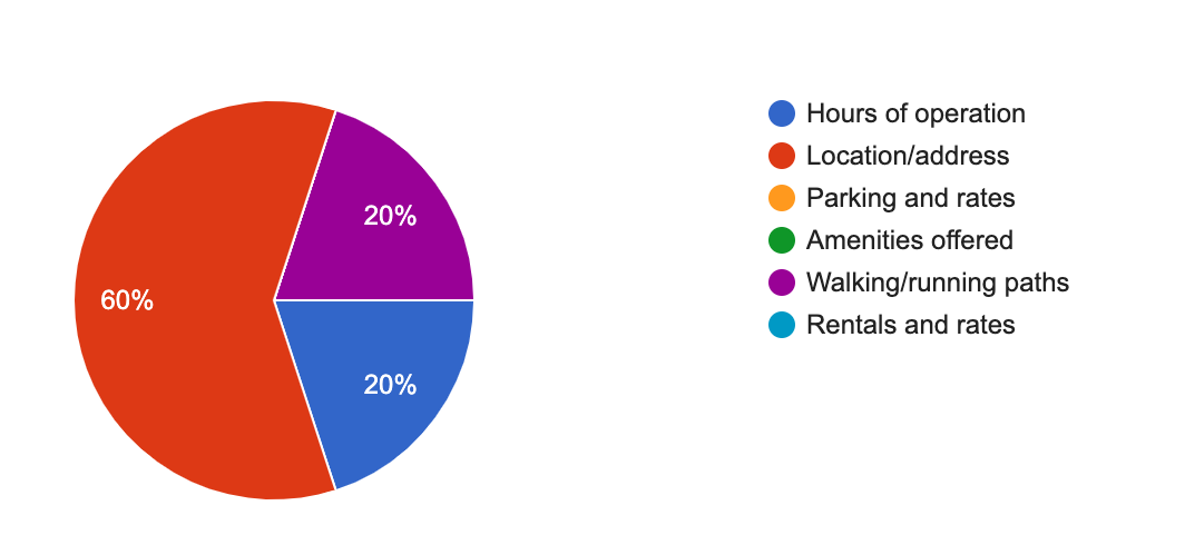
Desired Information
Evaluation Scenarios & Tasks
Tech Familirity
Desired Activities
Research Design
Background Questionnaires: Gathered demographics and website experience.
Task Completion: Participants completed 4 real-world tasks on the website.
Post-Task Rating: Rated task difficulty on a 1–5 scale.
Debriefing Interviews: Collected qualitative feedback about their experience.
Product Reaction Cards: Participants selected 5 words that best described their experience.
Think-Out Loud: Participants were recommended to think out loud while completing tasks
A pilot interview was held to identify any gaps in our testing approach.
The interviews were conducted remotely via Zoom, with participants' audio, video, and screen sharing recorded.
Participants completed all tasks using their own laptops, and no account creation was required to navigate the site.
Each interview involved one host, one moderator, and two observers.
Observers took notes in Google Sheets and tracked task completion success.
Scenario 2: Find out if Hidden Falls Regional Park has public water access.
Locate access times and address for public water.
Search for parking options for vehicles and boat trailers, and check if there are any associated costs.
Scenario 4: Navigate to the Highland Park page and select a picnic spot.
Identify accessible picnic spots for a friend.
Gather necessary details for reserving the spot.
Recommendations
To improve usability, we proposed the following solutions:
Enhance Navigation & Structure
Simplify the menu layout for intuitive access to features.
Introduce a clear and consistent navigation bar.
Reduce Cognitive Load
Break down complex information into digestible sections.
Utilize whitespace and concise wording to improve readability.
Improve Visual Hierarchy & Interaction Design
Establish a clear call-to-action with distinguishable buttons.
Prioritize important tasks and content using contrast and typography.
Inconsistent Verbiage & Design
Standardize design elements such as buttons, colors, and fonts. Align UI patterns with user expectations for a smoother experience.
Saint Paul Hidden Falls Homepage
Figure 1 is a screenshot of the webpage for Hidden Falls Regional Park. As you can see, the hero image is a photo of the Saint Paul skyline, not the park itself.
Wireframes for recommendations
Figure 2 is a simple wireframe showing what the site would look like with a reduced navigation bar and the hero image moved.
Thank you for visiting my portfolio! Feel free to reach out if you'd like to connect!
Figure 3 is a simple wireframe showing what the site would look like if the navigation bar is reduced, the hero image removed, and the drop-down menus implemented.
Future Steps
If given the opportunity to continue, I would:
Conduct follow-up usability testing after implementing the recommended changes to measure improvements.
Develop A/B tests to compare different design variations for navigation and form usability.
Expand research to include more diverse user demographics to ensure accessibility considerations are met.
Implement a long-term UX monitoring strategy using analytics and user feedback tools to track continuous improvements.
Insights
Through usability testing and analysis, we discovered that:
Navigation was a primary challenge: Users found it difficult to locate key features and content.
Information overload caused confusion: Excessive text and cluttered layouts made it hard for users to absorb essential details.
Lack of visual hierarchy impacted task efficiency: Users struggled to distinguish between primary and secondary actions.
Inconsistency: The site had inconsistency throughout with verbiage and design, this confused users.
Additionally, usability testing revealed:
Completion Rate: All participants completed scenarios with an 85.75% success rate.
Time-on-Task: Task completion time ranged from 2 minutes 24 seconds to 8 minutes 11 seconds.
Task Difficulty Ratings: On a scale of 1 (most difficult) to 5 (easiest), the average rating was 3.52.
User Sentiment: Participants selected mostly positive words when describing their usability experience.
Obstacles Overcome
During the research process, we encountered challenges, including:
Limited User Participation: Initially, recruitment for usability testing was slow. We overcame this by leveraging STP’s existing user base and offering incentives.
Inconsistent User Feedback: Some insights appeared contradictory. We addressed this by segmenting users based on their experience levels with the platform.
Time Constraints: Given the limited timeline, we prioritized key issues that had the highest impact on usability.
Scenario 1: Find an outdoor activity to do with a friend at a park.
Locate activity details (e.g., picnic, event).
Identify hours of operation and available amenities.
Scenario 3: Find pool practice times at a local aquatic center.
Look up times for practice without regular swimmers or children.
Identify the price of admission for pool access.


